Using dashboards to help unions understand Irish economic data
I’ve been working with the Nevin Economic Research Institute (NERI), a trade union funded Irish think tank, on a powerful new tool designed to provide unions and the wider public with detailed insights into Ireland’s economic sectors. It was recently launched at the Labour Market Conference at Ulster University and is completely free to access.
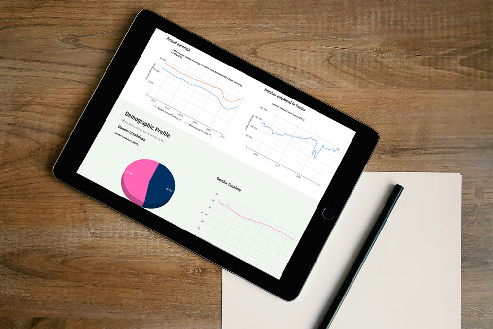
This new facility is a collection of online dashboards that offer a comprehensive view of employment trends, working conditions, and business performance across 19 sectors and over 50 sub-sectors. By making this data more easily accessible via the user-friendly graphs and tables, the hope is that it will equip unions in Ireland with the data they need to advocate for workers effectively.
Understanding the structure of Ireland’s economy requires more than just tracking overall employment figures. Since the global financial crisis, the Irish economy has shifted dramatically, with some sectors expanding rapidly while others decline. The dashboards provide unions with accessible, detailed data to analyse these transformations and identify key trends affecting workers.
These dashboards can be used to:
- Monitor employment trends across industries, helping to identify areas of growth and decline.
- Assess working conditions, including contract types, job stability, and remote work prevalence.
- Analyse wage trends and labour costs.
- Track demographic shifts, such as gender, age, and education levels within different sectors.
- Evaluate business performance, including turnover, investment, and value-added contributions.
- Looking at union membership per sector, including the historic membership trends.
The data comes from publicly available sources, such as official government statistics and labour market surveys. While these datasets exist independently, they are often scattered across different platforms, making it challenging to access them in a cohesive way.
The dashboards consolidate the raw statistics into a structured, interactive format, providing clear visual representations and sector-specific insights. Some of the data is patchier than others, and so each dashboard will dynamically only show data when it’s more robust and contemporary.
Costs were kept low by using high quality, licence free technology. The site is built in the powerful open-source Drupal system and uses and open-source MySQL database. The graphs utilise Google’s free to use Google Charts code library.
The data is initially only for the Republic or Ireland. There are plans to expand the facility to include data from Northern Ireland as well as the addition on more occupational data.
Check out the new dashboards at nerinstitute.net/dashboards.